
A week ago, I was thrilled to see that Divi 5 has now active Flexbox controls. Here, I'll give a few short examples of how to use Flexbox in Divi 5. If you're not sure what Flexbox is, read this post first and return here for examples.
Table of Contents
Flexbox in real life
You have probably seen websites with neat rows and columns centered and spaced in a particular way. On the other hand, ou have probably seen some not-so-neat designs also, where everything seems just out of place.
To achieve a nicely spaced row/column structure, one can use Javascript/CSS combination. Or, pure CSS on every element. Or, one can use Divi 5. Yes, Divi 5 incorporates Flexbox fully, and it's sort of a game-changer, because one really does not need to understand CSS anymore to achieve such effects.
One of the most common questions I've seen is how to align elements vertically within columns. Fun, huh?
Let's start with a demo page which you can find HERE. Upon clicking, it will open in a new tab, so you can see the effects of what I'm talking about here. For the record, it's done this way because posts (this one here) are not supposed to be created with Divi builder, but I can't show the design unless I have a page built with Divi Visual Builder.
Flexbox Demo: Center elements within columns
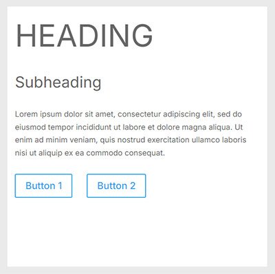
Let's start with a simple row with two columns, where we need some text and two buttons in the left column and an image in the right column; like this.
IMAGE
It looks nice, but when you create a row with two columns and the elements, it looks kinda out of place.
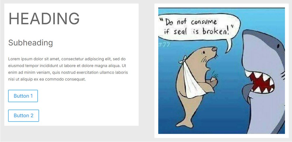
There's no alignment other than default, the buttons are one under another, and even columns are not the same size.
You can play with allignment settings all you want (in Divi 4, for instance), but you will not be able to reach the design shown in the first image without some CSS - or learn how to use Flexbox in Divi 5.
The Row Display Style
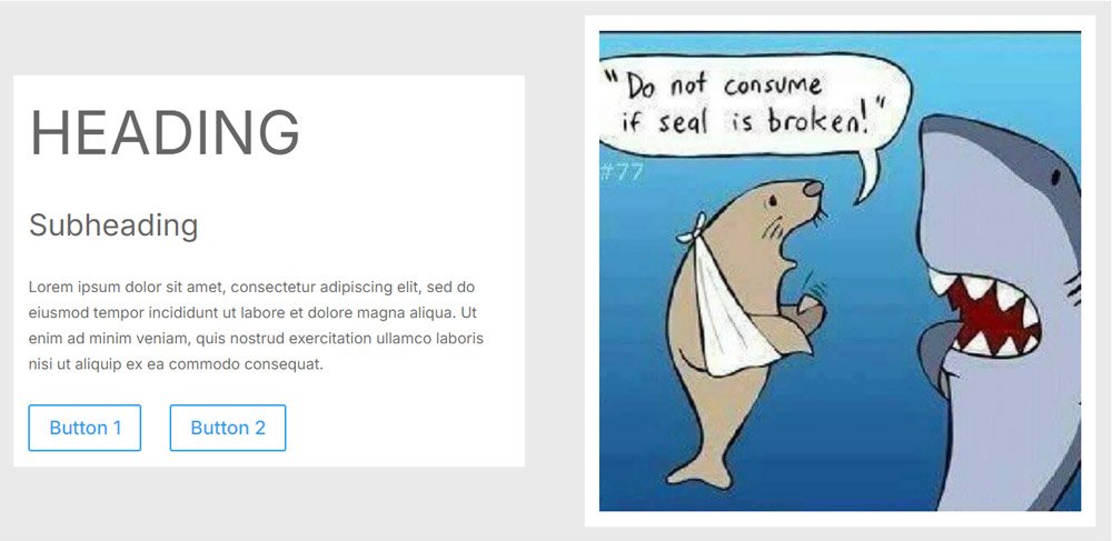
Remember, if you want to use Flexbox, the CSS Flexbox always has to be applied to the parent element. So, we change our row's display mode to Flex.
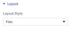
We do this by entering the row's properties and the Design Tab, where we'll find the Layout option. Under it, we switch the Layout Style option from Block to Flex.
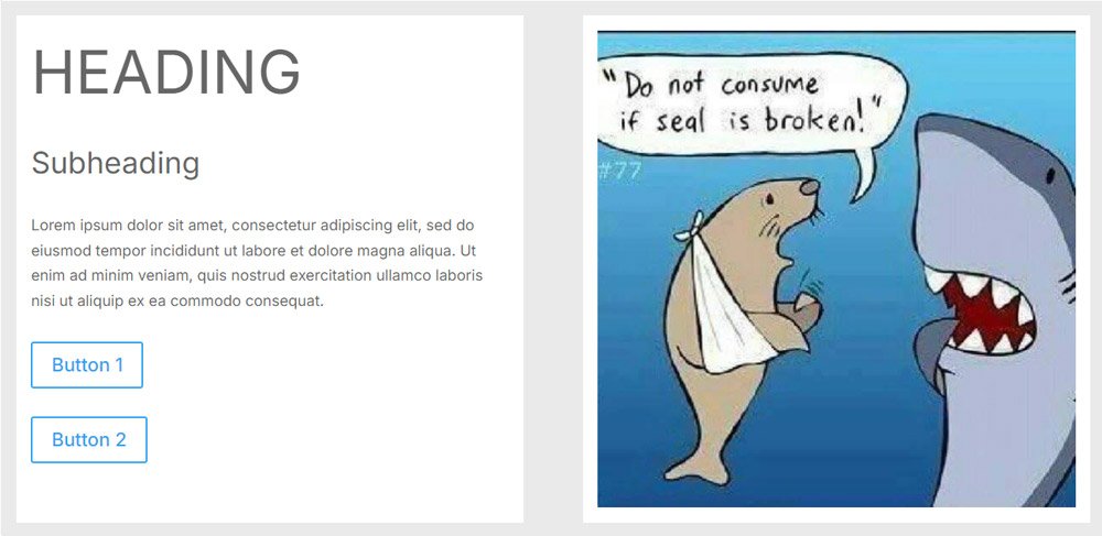
The immediate effect we can see is that the columns are now equally sizes, meaning they both fill the height of the higher column (in this case, the image).
In Divi 4, this same effect would be achieved by setting Equal Column Height property under row Sizing. Anything else you'd want to do, you'd have to do with pure CSS in the Advanced tab.
But, Divi 5 does not stop there.
In the next few steps, we'll
- change the spacing between the rows
- change how the buttons are aligned
- change the whole column 1 alignment
The Buttons
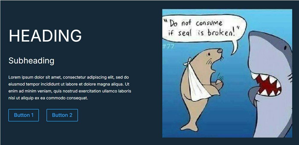
First, let's make the buttons display horizontally one after another.
The first step is to change the display style for the columns also - change both columns to Flex display style.
Then, we change also the display style of the row containing the two buttons - you've guessed it, we change it to Flex.
Then, we choose the Flex Direction as Row, using the options below.
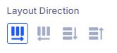
Instantly, the buttons align horizontally one after another, just the way we want them to.
We can finetune the display by changing the Horizontal Gap setting, which will change the distance between buttons.
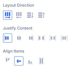
Center the content vertically
This one has been a nightmare before, but no more. All you have to do is go to the row's Layout settings and set the Align Items option to Center:
And there you go, the content is now vertically aligned within the main row.
Final design changes
Just to make it a bit more pleasant to the eyes, I've changed the row background to black and the text to Light. At this point, it starts to look like a legit hero or CTA section with all the alignment options done as we wanted them.
Of course, this is a demo, so you'd want to design the buttons and possibly other things to your liking. But that's not this post's main idea. We've tried and seen how to use Flexbox in Divi 5, and that's all.
I hope you've seen how simple it really is to use Divi's native Flexbox feature.
Until next time!


0 Comments