
Divi 5 is here, and it comes with a brand-new Flexbox-based layout system. This replaces the old block layout engine from Divi 4 and brings a faster, more flexible way to design right inside the Visual Builder. Every new row now uses Flex by default — and if you haven’t worked with CSS Flexbox before, things might feel a bit different at first. Flex layouts think a little differently, so it takes a quick mindset shift to really click.
The best part? You now get clear, visual controls for wrapping, direction, spacing, ordering, and alignment — no more digging into custom CSS or awkward workarounds. Divi 5 also comes with handy row presets, so you can build complex layouts in seconds without fiddling too much with Display settings.
Since Flex can handle so much more, a few of the older block-based features — like specialty and full-width sections — have been phased out. In this post, I’ll walk through the five biggest errors you might make when moving from Block to Flex in Divi 5, and how to avoid them.
#1: Forcing Flex Into a Block Mindset
Flex isn’t just a new set of controls — it’s a new way of thinking about layouts. And let’s be honest, change isn’t always fun unless we understand why it’s happening. The old Divi 4 layout system felt familiar and predictable for many designers, but it did come with real limitations. Anyone who’s worked with CSS knew those limits well — Flexbox was built to solve exactly those kinds of problems.
The first pitfall to avoid is trying to treat Flex like the old block system with a few new tricks. In Divi 4, everything stacked vertically by default. If you wanted elements side by side — say, two buttons — you had to create extra rows and columns inside a section. It worked, but it could get messy fast.
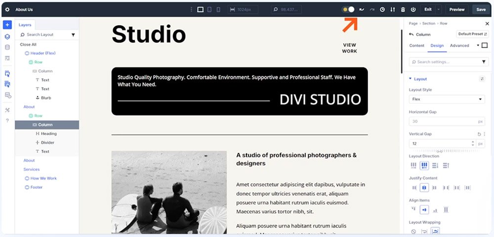
Video Source: Elegant Themes
Divi 5 changes that. Now, all containers (Sections, Rows, Columns, and Groups) use Flex by default. This means you get precise control over how child elements are arranged, right at the container level. Flexbox shines because it adapts — it positions elements based on available space and the content inside them, creating layouts that naturally adjust to different screen sizes without rigid positioning.
Here’s a simple way to think about it: block layouts stack elements vertically, while Flexbox lets you choose whether they line up in a row or a column — and gives you control over how they wrap, align, and space themselves.
Every setting you tweak in Divi’s new interface maps directly to real CSS Flexbox properties. You’re not just designing visually — you’re working with the same layout engine that powers modern web design.
#2: Not Breaking the Margin Habit
Old habits die hard — especially when it comes to spacing. In Divi 4, if you wanted visual space between modules, you added margins. Vertical gaps came from bottom margins, horizontal ones from left or right margins. Even the Gutter Width setting used margins behind the scenes to create spacing between columns. That approach worked, but it wasn’t exactly elegant — and it’s not how Flexbox is meant to work.
With Divi 5, there’s a better way. The new Flexbox system introduces dedicated Gap controls for rows and columns, found under Design → Layout → Horizontal and Vertical Gap. These correspond directly to the CSS gap and row-gap properties — the modern standard for spacing elements in Flex layouts.
Here’s why this matters: vertical gaps apply automatically when items wrap onto a new line, and horizontal gaps appear between elements that sit side by side. No need to add margin after margin. You can even use advanced CSS functions like clamp() or calc() to make your gaps responsive.
In short, the Gap setting is smarter and cleaner. It automatically adapts based on your Flex direction and the number of child elements inside the container. Margins still have their uses, of course — but when it comes to spacing within a Flex container, Gap is the new go-to.
#3: Underusing Reverse Flow & Ordering Controls
Here’s a Flexbox superpower that’s easy to overlook: visual order doesn’t have to match the HTML order. By default, child elements in a Flex container appear in the same sequence as they do in the code. But with Divi 5’s Flexbox controls, you can flip, reorder, or rearrange elements visually — without touching the underlying structure.
The Reverse Direction toggle under Layout Direction lets you instantly reverse the order of elements along a row or column. Think back to the example from Pitfall #2: in the Layers view, your elements might appear as Heading → Divider → Text Module. That order makes perfect sense for accessibility — screen readers, for instance, expect the heading (an <h2>) to come first. But visually, you might want to display it differently.
That’s where Row Reverse and Wrap Reverse come in. They let you keep your semantic HTML order intact while flipping the visual flow however you like. It’s the best of both worlds — accessibility-friendly code and total design flexibility.
You can also control the order of individual modules using Child Element Ordering, found under a module’s Settings → Content → Order. This lets you manually adjust the position of one element without changing anything else in the container. Different tools, same result — use whichever fits your workflow best.
#4: Not Knowing How Flex Shrink & Grow Fit Into Child Element Sizing
Here’s where many designers first get tripped up: Flex layouts don’t just depend on fixed widths and heights — they rely on how elements shrink and grow within their container. Without using these controls, your layouts might not behave the way you expect.
In Divi 5, every child module inside a Flex container can have a set width or height, and can also adjust dynamically based on available space. For example, if you have Text Modules set to 45% width, two will fit neatly side by side. But add a third one, and suddenly there’s leftover space at the end of the row. That’s where Flex Grow comes in — enabling modules to expand and fill that extra room automatically.
You’ll find these options under Child Element → Design → Sizing → Grow to Fill, Shrink to Fit, or Custom. If you’re coming from Divi 4’s block layout, setting widths and heights will feel familiar, but Grow and Shrink add a new layer of flexibility. They let you mix fixed sizing with responsive behavior that adapts to any container.
Using Shrink to Fit and Grow to Fill — along with flex-basis — is key for building layouts that stay balanced and fluid without relying on endless breakpoints. Combine that with smart CSS functions like clamp() for typography, and you’ll find yourself needing far fewer manual width and height adjustments than before.
Pro tip: Think of Grow and Shrink as the “give and take” sliders of your layout — they decide how much each element flexes when space is tight or wide open.
#5: Forgetting To Set Wrap
→ Flex won’t break to new rows unless you tell it to.
We mentioned wrapping earlier, but it deserves its own section. New flex containers default to no wrap. This can have unexpected consequences in certain cases. For example, if you add four child modules, each at 50% width, you’d expect them to show on two Flex Rows. Your problem is simply that you have to allow your container to wrap.
Divi includes a toggle called Layout Wrapping, which has three states: no-wrap, wrap, and wrap-reverse. You must enable wrap if you want modules to break to new lines at a threshold. That’s how Divi supports multi-row structures inside a single container (Nested or Multiple Rows aren’t the only way to do this now).
Take Your Time to Learn Divi 5's Flexbox
Flex in Divi 5 is a big step forward — it’s far more powerful and flexible than Divi’s old block-only layout system. But like any powerful tool, it takes a bit of learning to really get comfortable with it.
Remember, Flexbox isn’t something unique to Divi — it’s a core part of modern CSS. The good news is that Divi gives you visual access to all the same properties you’d use in code, right inside the builder. Once you understand how Flexbox works at its core, everything in Divi 5’s layout controls will suddenly “click.”
Because Flex works so differently from block layouts, it’s worth investing an hour or so to really grasp the fundamentals. A great (and fun) way to do that is through FlexboxFroggy.com, an interactive learning game that walks you through 24 quick challenges to teach Flexbox basics step by step. It’s engaging, practical — and let’s be honest, a lot better than an hour of doomscrolling.
Pro tip: The time you spend learning Flexbox will pay off every time you build a layout in Divi 5. Once you “get it,” design becomes faster, cleaner, and a whole lot more intuitive.


0 Comments